Emily Resort: a new tea label series
A new design for a series of 20 Emily Medical Center tea labels: consistent structure, color groups and artwork prepared for print handoff.
View the results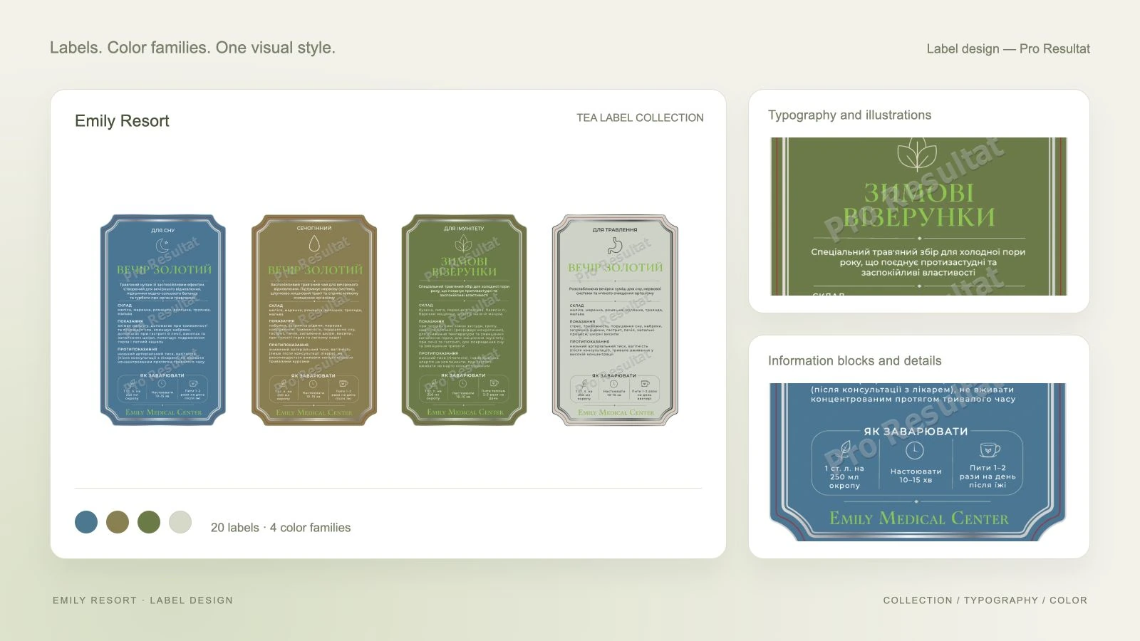
- Series
- 20 labels
- Color groups
- 4
- Artwork page size
- 80 × 130 mm
- Preparation
- For print
About the project
We redesigned the tea labels for Emily Medical Center, replacing the outdated artwork with a cohesive product series. A shared composition, color groups and clear information hierarchy connect the different products.
We developed the label layout, typography and color palette. Following approval and refinements, we prepared the artwork series for print.
From the previous presentation to the new label series
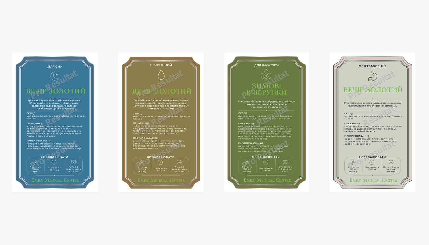
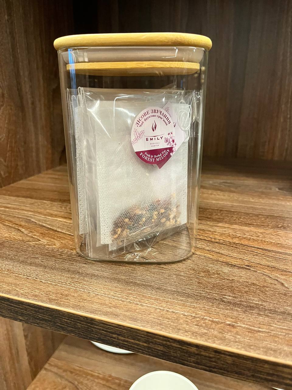
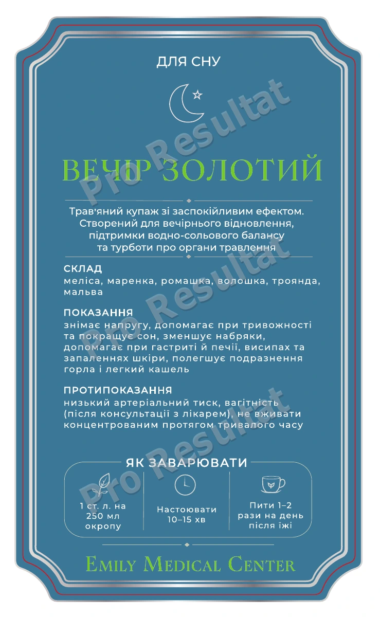
The previous packaging used compact colored labels. The new design brings the product name, description, ingredients and preparation instructions together in one layout. A shared composition and color grouping create a consistent presentation across the range.
Previous presentation
New label design
The task: a new appearance with structured information
A compact label needs to accommodate the product name, a short description, ingredients and other text sections, plus preparation instructions. We needed to organize these elements and maintain a repeated structure across products.
01
Structure
Defined positions for the name, description, information sections and instructions.
02
Series
Applied the composition across product names and four color groups.
03
Preparation
Refined edges, contours and content placement for print handoff.
One composition across the range
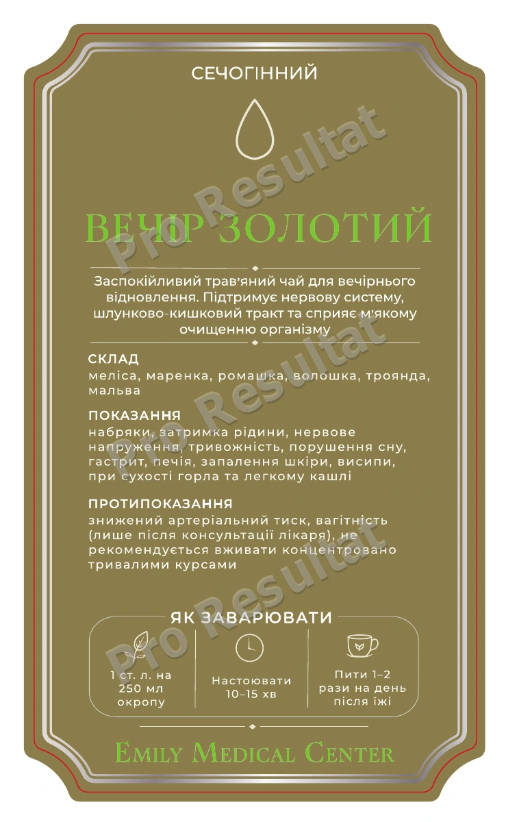
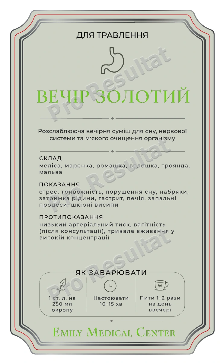
The upper area carries the group and a small icon, followed by the tea name, a short description and text sections. The lower area contains preparation icons and the Emily Medical Center signature.
Repeating this structure makes the same types of information easier to locate across labels. Names and text length change while the layout principle stays consistent.
Color as part of the series
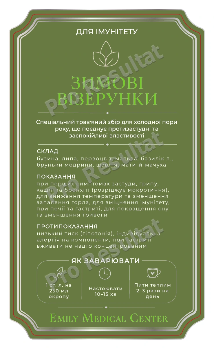
Blue, olive-gold, green and light backgrounds distinguish the product groups. A shared frame, typography and information layout keep the series consistent.
Edges and contours for print handoff
The shaped frame follows the label outline. A cutting contour along the edge marks the artwork boundary for the print provider. Revisions included aligning the frame and text relative to that boundary.
The artwork page format is 80 × 130 mm. Label stock, printing method and cutting specifications are agreed with the print provider.
The result: a complete artwork series
We created new artwork for a series of 20 labels, worked through revisions and handed the materials over for print. Different products share a common composition and color grouping.
Explore design for business materials in Web Design, or see our visual identity refresh service for existing materials.