Avelora Beauty: a new logo for a visual refresh
Two visual directions for a beauty brand: a typographic logo and a monogram. The client selected the typographic direction for use.
View the results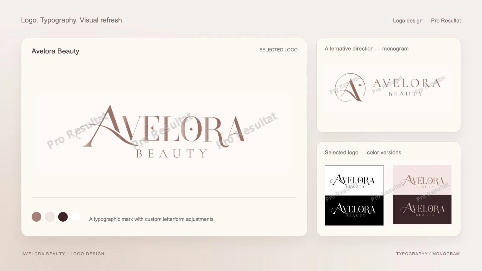
- Visual directions
- 2
- Client’s choice
- Typography
- Context
- Visual refresh
- Application
- Web and brand materials
About the project
Avelora Beauty requested a new logo during a visual refresh and website redesign. The mark needed to form part of that update and work both on screen and across branded materials.
We prepared two logo directions, colour versions and application examples. The new mark formed part of Avelora Beauty’s visual refresh.
- Brand
- Avelora Beauty
- Service
- Logo and visual identity refresh
- Applications
- Website and branded materials
The task: provide a clear choice
We prepared two distinct approaches. The first makes the Avelora name the main element; the second pairs the name with a separate monogram. This let the client compare the character of the mark and how it could be used.
01
Typography
Focus on the name and custom letterform adjustments.
02
Monogram
A standalone mark paired with the name and vertical versions.
03
Application
Color versions and visualizations on branded materials.
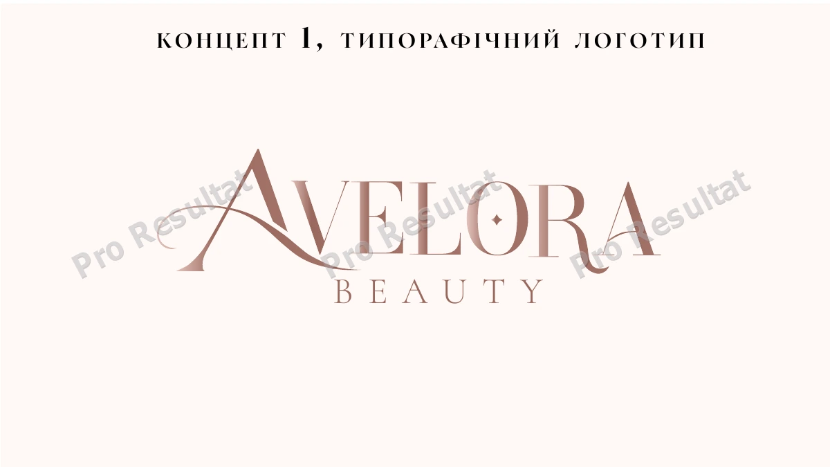
The typographic direction selected by the client
The Avelora wordmark uses Bodoni Moda as a starting point, with manually refined letterforms. Contrasting strokes and the flowing A shape establish the main wordmark’s character. Beauty uses Cormorant with spaced lettering.
The client selected this typographic direction. The name remains the main element, while the second line supports the composition.
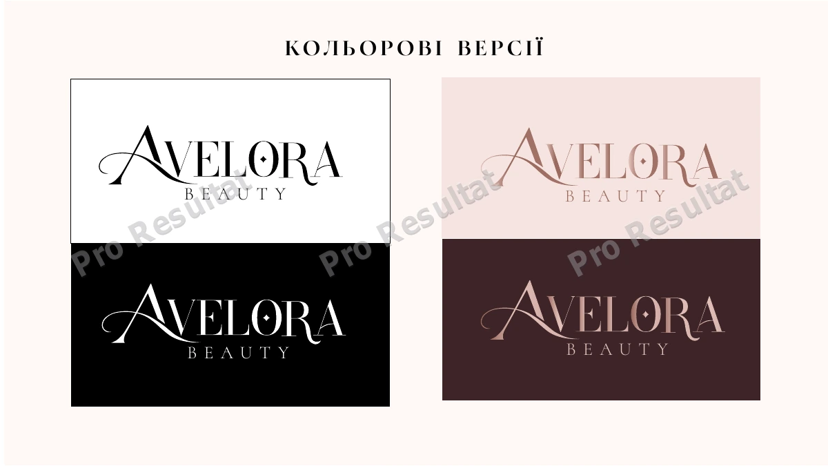
Color versions for different backgrounds
We showed light, dark and soft pink combinations. The same wordmark can be reviewed on white and black backgrounds and in a warm brand palette, helping agree on its use across layouts.
The alternative concept: a monogram
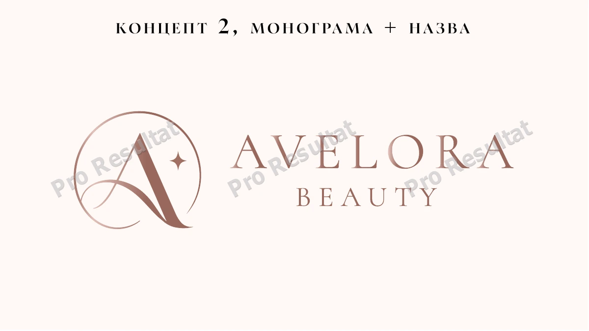
The second direction combines an A monogram with the Avelora Beauty name. A separate symbol offers another composition principle: paired with the name or used as a compact element. We show it as an alternative considered during selection.
The result: a selected logo for the visual refresh
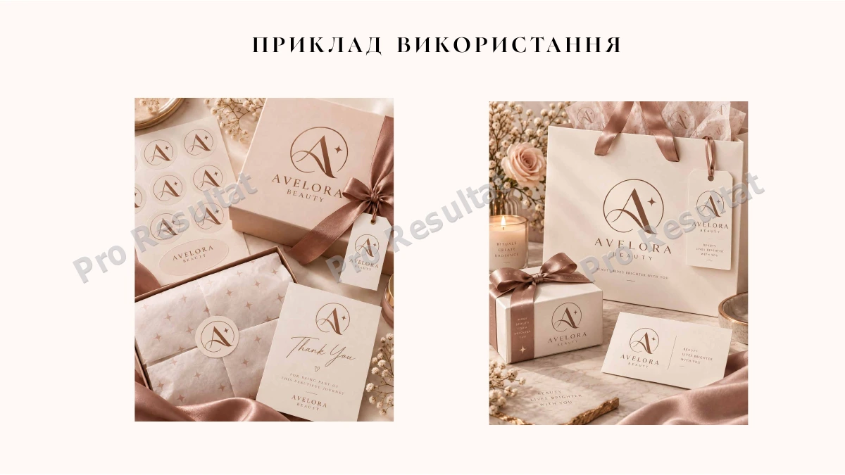
We developed two visual directions, and the client chose the typographic logo. Reviewing backgrounds and application examples allowed the discussion to cover both the mark itself and its place in subsequent design.
Explore logo and visual identity design for a new mark, or a visual identity refresh for existing materials. See a different approach in the Instrument Expert logo case.